Thursday, April 29, 2010

Pastel Life Drawing. Gesture and longer poses.

Last night our very lucky figure drawing group got to work with a new model to us.  She was just fabulous! 
We started with some wonderful gesture poses, 2-5 minutes long.  I was working on a textured piece of tan paper, and I used one dark and one white piece of Nupastel to block in the shadows and highlights.


For the longer pose, I ended up working from two different vantage points (couldn't hog the beautiful view all night!)  The first one I started was very colorful.  It's not resolved yet (the lighting scheme isn't very strong yet, and I need to pull the colors together) but I am liking the bold look!


She had the most beautiful neck!

Next I perched up a little higher, sitting on a corner staircase, going back to the tan pastel paper and two pieces of Nupastel.


The wrist feels a little awkward, but other than that I like it!  I am questioning whether or not I should indicate a little bit more of the pole she was holding on to, so that her suspended arm does not feel so odd.

You can see more of my figure drawings in my Fine Art on Etsy Shop.

Watercolors from the live nude model (a few days late!)

Somehow I forgot to share these lovely watercolors from last week!  So a quick post to catch up...


The left side of our model was closer to the light, creating areas of high contrast and harder shadows, while the right side was fading into the shadows, so I only focused on defining the left side.  I think its tricky to work in a hat and make it work!  Sometimes it feels cartoonish. 


I am liking this soft and sensual pose...everything except for the treatment of the face! I need a little more, or a little less, information...I need to resolve it!

I forced myself to start with olive/sap green instead of my usual pink and purple that I normally use when I draw from this lovely model!  I like the layers of color...sap green under orange under purple.

Tuesday, April 27, 2010

Painting in Watercolor. Finishing several pieces!

I have really been enjoying working with watercolor from the live model, but I don't always finish the piece during our drawing session.  Sometimes, I work without a photo reference, like when I finished these two pieces.


I had enough established in the figure where I could go back and add additional shadows or color or high-lights.

Other times, I am lucky enough to get a good start, AND a photograph to work from at a later time.

This is the painting from the live model  I was trying to finish today.


I first worked on covering all the areas that were still very light or white - like the drapery and the table she was sitting upon.  I want the nightgown to feel very crisp and light against the deeper colors.  I am also trying to keep the pallette "antique" looking - creams, umbers, grey-blue.  It's coming together, I like taking a break and taking photos - it helps me to see what I need to work on.

Not quite done yet (and I appologize for the large letters!) I don't quite know what to do with the table area - how much detail to put under the drapery.  I'm happy with the blue drapery and all of the color I am bringing into her nightgown.  I'm also liking her hair and bun.  What I want to keep working on is pushing the value range and establishing the light source.

I will keep you posted!  Hopefully I'll be able to concentrate a little more tomorow...today Jack was sitting next to me, painting, eating, slurping hot cocoa, making butterflies, squashing play-doh...all the while giving a running commentary of what each activity was doing (it was a singing commentary to boot.)  If anyone is pouring, I'm drinking.

Friday, April 23, 2010

Custom Figure Drawing in Charcoal. Commission complete!

I loved working on this custom drawing request! I put the final touches on this week, using a couple of my favorite tools and techniques.


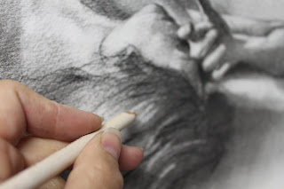
This is one of my favorite tools for drawing with charcoal - it's actually an eraser that you use for erasing type.  On one of the old-fashioned ribbon typewriters! It's even got the little blue plastic brush on the end.  I don't even know if you can buy them any more...but there's probably something else out there by way of a detail eraser.

I use the eraser pencil to pull out the smallest hi lights on the fingers and in the hair.

In other areas, where I wanted to soften shadows, I used paper towel.  Occassionally I use my finger tips, but that can tend to leave oils behind and you may not be able to remove all the charcoal that you intend to remove.


The final piece! 

You can see more samples of my figure drawings in my Fine Art on Etsy shop!

Thursday, April 22, 2010

Custom Watercolor Portrait of Mother and Child. Just finished!


I have just finished this portrait!  It is painted with watercolor on Aquaboard, 9" x 12".  The last couple of things I had to work on were the mother's profile and the blanket on her lap.


I had re-worked her profile several times, not fully satisfied with the results.  Finally, I turned both pictures sideways, and that new perspective allowed me to figure out exactly what adjustments needed to be made!  That technique worked so well, I used it again later that day when I was finishing up another drawing (I'll post that one later!)


This is the painting right before I darkened the blanket.  My eye was not staying in the middle, where I wanted the focus to be - on mother and child.  It kind of fell right off her lap!  I like it much better now that I added layers of sap green, umber and a little purple (in the top photo)

You can see more of my Custom Portrait Samples in my Fine Art on Etsy shop!

Tuesday, April 20, 2010

Blog2Print - Have you tried it? I did!

A few months back I noticed an ad for "Blog2Print" and thought -"AWESOME! I need to do that!"  I had just ordered a book from Snapfish for my husband for Christmas that had a bunch of pictures from our Anniversary trip to Rome.  While I was please with the book, I didn't put all of the pictures in, nor did I include as much information as I had put on my blog where I had already posted a day-by-day diary/recap of our trip.

(on the left is my hard cover Snapfish book, on the right is the soft cover Blog2Print book)
David had mentioned that we should really try and print out my blog since I had included such a great, detailed re-cap of our trip.  But I couldn't figure out HOW to do it!  Until Blog2Print came along.

Now, the first time I tried it, I never actually ordered a book.  You had to upload a "range" of posts by date.  So, when I put in my dates from the first Italy entry to the last, unfortunatly there was one entry that didn't belong.  I couldn't figure out how to eliminate just one post.

Then, about a month ago, Blog2Print sent out a notice that they had added NEW features - including the ability to selectively delete posts! Awesome! Now I could JUST print out the Italy entries.

(inside the Snapfish book, I mostly included pictures.  Blog2Print I imported photos AND text!)
Building the book was super easy.  I just enterred the name of my blog, selected the date range I wanted to print, eliminated specific posts, selected a title, a dedication page, and images for the front.  My only issue was the fact that I couldn't figure out how to change the image on the back cover.

I ordered my book and it arrived SUPER fast!  I am so glad that David and I now have this wonderful momento of our trip.

I am looking forward to trying out Blog2Prints other features.  I'd love to print out my blog entries by subject - drawing in pastel, paintings in progress, drawing techniques, etc.  I would also like to play with how the book is organized when it is printed - changing the size of the photos, making sure the correct text lines up with the correct photo, etc.

I can imagine that families who have a blog would LOVE to be able to produce a book each year, or an author would love a book of their blog, or a recipe blog would be a FABULOUS book in print!

Have fun making your book!

Monday, April 19, 2010

Italian Veggie Bake. Colorful, crisp, delicious recipe for vegetables!

Over the weekend we participated in an Italian-themed Progressive dinner with friends and neighbors.  It gave me a chance to make one of my FAVORITE vegetable dishes.  I have made it several times, and it always dissappears!  It smells SO good when you are making it...

Italian Veggie Bake by Kraft (Photo by Kraft)

1/3 Cup Kraft House Italian Dressing (I used Zesty Italian which is also good)
1 large onion, chopped
1 small eggplant, cubed
1 medium zucchini, cubed
1 large red pepper, chopped
1 pkg (6 oz) sliced mushrooms
1 can (14 1/2 oz) Italian-style stewed tomatoes, drained, cut up
1/3 cup Kraft Shredded Parmesan Cheese
1 Tbsp. chopped parsley

HEAT dressing in large skillet on medium heat. Add onion; cook 5 min. or until tender. Add eggplant; cook and stir 5 min. Add zucchini, pepper and mushrooms; cook and stir 5 min.

ADD tomatoes, bring to boil. Reduce heat to low; cover. Simmer 15 min. or until vegetables are tender, stirring occasionally. Pour mixture into casserole dish; sprinkle with cheese. Cover and refrigerate until ready to serve.

PREHEAT oven to 350°F. Bake 25 to 30 min. or until heated through.

This last time I made it, I used a large eggplant, two zucchinis, and 8 oz of sliced mushrooms (I know what you're thinking...REBEL!)  with a little extra Italian dressing.  I did notice that 15 minutes of simmering may have been a tad too long - the veggies got just a little over-cooked (but still yummy!).  Also, if you have it, Pecorino cheese would be a tasty alternative to Parmesan.

My mom has also adapted this recipe for almost any vegetable that she has around.  I'm sure you could use yellow squash, red onions, portobello mushrooms, fresh tomatoes, etc. with equally delicious results!

Charcoal Drawing from a Photograph. New Commission work in progress!

A quick update before I head back into the studio!  I'm working on a great project right now, a vision that one of my client's had in mind.  She really liked the pose from this watercolor of the female nude...


But liked the drawing style from one of my classic female nudes


So I pulled both of those together!  I staged a model in a similar pose, taking a bunch of reference photos and piecing together the exact look I wanted.

Then, I worked on a piece of watercolor paper that is mounted to foam core (gives a lot of stability to the paper) starting with vine charcoal and an eraser to block in the largest shapes and values.  The surface is 16" x 24".


Using a wet brush, and just clear water, I washed a few areas of charcoal where I wanted the lines to be softer and the values more subtle.  Once that dried, I went back in with a soft charcoal pencil and started pushing my values further.


I am still working on this piece - Making sure that the values are all accurate and everything is correct in scale.  Right now, seeing it on screen, the shoulder on our left is too dramatic - even though it is close to the light source, and even in my reference photo the lighting is quite dramatic at that point, it is "jumping out" too much. 

I think I also might push the value a little darker of the cast shadow from the model's legs to the wall...it's an important element. Even though the legs are probably the focal point, I did not place them in the top center of the page - I had to take note of the whole "L" shape of the model, placing the whole figure towards the left side of the page.  I think the stronger cast shadow would help balance the piece.

Any thoughts as I continue?

I am always open to discussing your visions, as well and would love to work on a project for you! Please contact me any time thru my Etsy shop or my Art Page on Facebook.


Thursday, April 15, 2010

Custom Watercolor Portrait from a photograph. Commission work in progress.

I am in one of those happy-busy places right now...so many great projects to work on I can hardly pick what to draw when I finally find myself with some time in the studio!

This is a portrait commission that I just began a couple days ago.  The client sent this precious photo of mother and child.  The only problem was that some of the information was missing - the top of the head and the side of the arm, which they indicated thru a line drawing. 


Working on a 9" x 12" aquaboard, I lightly sketched the two figures using a soft purple watercolor paencil.

I slowly added washes of color to define the major shapes and shadows, also allowing some of these shapes to overlap - such as the dark shadows in the hair, where the edges are lost in the photograph as well.

I am really liking the amount of flexibilty I have with the Aquaboard.  I am able to "erase" a dry area with a little water and a stiff brush - such as the highlight on the baby's profile.
There are a few challenges that I am working on.  One is the minimal amount of information in the mother's face - just the tip of the nose and a little bit of the chin.  The other is the strong cast shadow that was created by the flash when the photo was shot.  I want to minimize the dark shadow line on the figures, while still giving them shape.

I am very pleased with all of the color I picked up in her hair and look forward to bringing more color into her shirt...white drapery can have so many wonderful colors in the folds!


And of course, finding time to paint isn't always easy! That afternoon my son Jack was right next to me, trying out every one of my watercolor pencils.  (Note to self: close pantry door BEFORE taking photos!)

You can see more of my Custom Portrait samples in my Fine Art on Etsy shop!


Sunday, April 11, 2010

New Watercolors from the Live Female Model

Our Thursday evening figure drawing group decided to work form two long poses last week, and I worked in watercolor on Aquaboard.  This time, I started sketching with watercolor pencils, then added watercolor washes over the drawings.


I like the gestures of her hands and the turn of her head.  The red drapery was beautiful and captured a lot of warmth.  This photo is not as dark as the original, but even so, I do need to go back and add some more color to the background.  I'll just add it to the pile of paintings that need to be finished!


I really liked this pose.  So simple, but with beautiful shadow shapes on her back.  It's almost an afterthought that she is nude.  It feels very natural, very peaceful.  I'm pretty happy with this painting as it is.  I worked back and forth painting with watercolor and drawing with watercolor pencils.

Ants on my Peony Flowers. I guess that's OK!

Three years ago I planted peonies in my back yard...hoping against my terrible track record in the garden that they would survive!   They are doing very well - last year they were covered in beautiful blooms, big pink and white flowers.


I noticed last year that ants were ALL over the buds! I thought for sure an ant colony was living in that flower bed. This year...they're back! We had about ten days of warm weather and the peonies shot up about 18 inches - and the ants are here!

I asked about this at my local nursery - what could I do to remove the ants from my peony buds? The gentleman recommended regular ant killer sprinkled around the base.  Then I mentioned the problem at my bunco group.  My neighbor nearly jumped out her chair and said "NO - it's ok! They are eating the sweet wax on the flower!"

Well, she's right! Apparently ants enjoy eating the sweet waxy coating over the buds.


So I have relented and allowed the ants to enjoy their buffet...and look forward to the beautiful blooms :)

Saturday, April 10, 2010

New pastel drawings from the live model. Classic and modern.


Lucky, lucky me...I got to draw from a (new to me!) model on Wednesday evening.  Lovely model - she had beautiful hand gestures, great poses, wonderful "stage presence".  She also had quite a few tattoos, but I decided not to include those because I wanted to focus on her beautiful figure.

The lighting was wonderful - the light and shadows were very well defined.  Cast shadows were crisp and dark, shadows on her form were soft and deep.

The paper is a cool, light blue, and I had started with light purple and blues to define her over-all shape.  As I added more colors, I think it got cooler, not warmer.  The tricky thing was that I was in a dark corner and couldn't see my colors very well.  Now that I have it home, I think I will layer a bit more color over the drawing.

I loved this alternative view from the corner of the studio!  I was actually sitting on a corner staircase, slightly above the other artists, and again the lighting was strong and dynamic.  This is a mint colored paper, but not bright - kind of a cross between mint and grey.  I used only a couple of colors, focusing on capturing the beautiful, full shapes of her breasts, legs, and hips, not worrying if everything was to scale or drawn perfectly.

It feels fresh and modern, and I love the variety of drawing techniques I used to capture her figure.

You can see more drawings of the female nude model in my Fine Art on Etsy shop!

Tuesday, April 6, 2010

Does Paid On-line Advertising Work? My March experiment.

I have been selling my art on-line via Etsy for almost 2 years now.  I have been building this art blog, my presence on Twitter, and my Fan Page on Facebook.  I have tried selling in other venues such as 1000 Markets, but find that maintaining two stores is not easy nor managable with the time I have available to spend on the computer.

One of my main goals is to be able to spend more time creating and listing new items in my Etsy shop, and less time driving the traffic to my store.  So, I had a good sales for the month of January and February, and I took some of that money and invested in some on-line advertising for March.

First, I chose a smaller blog that I discovered on Twitter.  It cost $15 for a spot on the side of the blog, the image was probably 175 x 175 in size, and selected by the blog owner.  When I signed up for the campaign, I suggested that the owner look at my "sold" items, to get an idea of what people are buying in my shop.  (I would have picked a popular print or one of the nude drawings, both of which sell very very well).  I was a little surprised, and dissappointed, to see that they had selected one of my Angel paintings - not that I am not proud of them, but they do not best represent what is in my shop.

When I contacted the blog owner, they explained that they felt their "readers" would like that item the best.  When I asked if it could be changed, they said "no". 

For the month of March, my Google Annalytics show that 21 visits to my shop came from that blog.  Each visitor spent an average of 1:52 minutes on site and looked at 5 pages per visit.  I do not know if any sales directly resulted from those 21 visits (which is approximatly .0019% of the monthly viewers on the blog). 

My other experiment was with a very high-end, high traffic blog.  A 125 x 125 advertising spot on the side of the blog was $250 for the month.  This blog guaranteed a certain number of "impressions", or views, of my ad.  I believe my ad bought 1,100,000 impressions.  One thing the ad staff let me know, was that an industry standard "click thru" rate was about .1% (POINT one percent) So what is that...if I get the industry standard of click thru...1100 clicks.  But according to my Google Annalytics for the month of March, 226 visits came directly from the blog ad.

Again, I can't tell if any sales came directly from the ad.  About 31% of the visitors from the blog were new to my shop, a stat that surprised me. I was hoping that it would bring a lot more new visitors to my work.

So...what do I recommend to those testing the blog advertising waters for the first time?

*make sure you get to pick what item you want to promote.  You know your clients, you know what sells in your shop.  It's your money!

*have a great looking ad if you are going to invest money in the ad space.  I think I fell short in this category on the expensive blog...but unlike the smaller blog, the large blog was willing to change my ad from the first one I provided to a second one I created which looked better half way thru the month.

*pay attention to when you are getting sales and how people are getting to your shop - my biggest traffic sources are my blog, facebook and Twitter.  And I can always tell when I have been actively promoting on-line - because the sales follow shortly after.

I'm not sorry that I invested $265.00 in this advertising experiment.  I had the money to do it, and I wanted to know if it would work for me.  For now, it seems like I should keep doing what has worked best for me so far - keep making art, make sure I talk about it on my blog, and promote it to my fans and twitter followers.

(A note to my fellow Etsy sellers...I did not renew at all for the month of March.  I only listed new items or re-listed prints that sold. )

And a note about Karma...I was incredibly grateful that Etsy published my story about my success on Twitter in the Etsy Blog on March 10th.  It meant a HUGE boost of traffic to my shop, and it helped me to not sweat the fact that I had invested this money in advertising! I had a great month of sales on Etsy and I am so thankful for the exposure.