Sunday, August 31, 2008

Figure Drawing Techniques...6

Ok it's not a figure..it's a puppy...but the basic principle of figure drawing can be applied here as well. These four photos show the progress just from an hour of sketching - I have a ways to go - but I thought I'd show you how I got started.

This is a cute grey dog, whose breed I'll have to post later cuz I forgot. It is a custom portrait for a gift - I can't wait for the owner to see it!

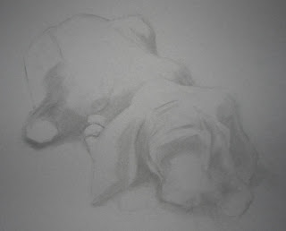
I started on medium grey matt board. The first few minutes is just getting the gesture of the body correct. Making sure I have enough negative space around the dog to allow for framing. (the pictures are cropped...a
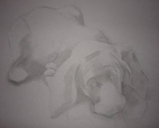
ctual page is larger)

Then I slowly block in areas of shadow. This is done with vine charcoal which is very easy to manipulate and erase if necessary.
I follow that by further defining the major shadows and shapes, being sure to work on the whole dog as to keep proportions acurate.


I start to further define the toes, ears eyes and nose, using a hard charcoal pencil.


I slowly add the highlight, again thinking of the whole dog. I want to develop the whole portrait at once - not get caught up in just the eyes or the paws, which can be very easy to do.


So that is where I am now...I will keep you posted on my progress! And here's a shot of where I was working. At the kitchen table. Even though I have a studio in the basement. But it was hot down there! And there's AC up here! Cut me some slack!

Wednesday, August 27, 2008

Figure Drawing Techniques...5

Black and white figure drawings can lead to succesful figure drawings in color. Black and white allows you to focus on proportion and a range of value. When you add color, there is a whole new element that you must study in order to use it succesfully.

The color phenomenon that I want to talk about here is the relationship of blue and red, and how the pairing of blue and red can enhance a drawing.
In this figure drawing, there were two different light sources falling accross the figure. If I treated the light the same way on both sides of the figure, the figure would have appeared flat. By choosing to have a warm (red) side and a cool blue side, it adds dimension to the figure.

Red and blue have a jarring personality - take a bright true blue and place it next to a true red and your eye vibrates a little. The eye does not read red and blue in the same way, causing a vibration (this phenomenon always makes me think of 3D glasses). As artists we can use this to our advantage.


When you have a highlight, such as the one on her hand, you can make the white highlight "pop" a little by using a shade of red on one side and a shade of blue on the other.

Highlights will appear brighter if you use a warm color on one side and a cool color on the other.


Fellow artists - have you used red and blue with a purpose? Share your work and your technique! Post a comment and a link to your work!

Tuesday, August 26, 2008

My Favorite New Word

OK. Sometimes what Jack says makes me laugh...

He got out a deck of number-flash cards that his Aunt Vienna gave him (even though they have Disney Princesses on them...go figure) and was saying all the numbers. So I'm watching and listening

"Nineteen...sixteen...eighteen...Fiveteen"

"Fifteen, buddy"

"Fifteen...fourteen...zeroteen"

"Uh Jack...that's a ten"

Zeroteen. Definitly my new favorite word.

(Click on the title to see Jack painting!)

Sunday, August 24, 2008

Latest Commission


I'm just getting started on a commission for a local auction house. The owner has asked for a view from the back of the auction house in the style of Leroy Neiman - lots of color and exciting brushwork, not too much detail on the faces.


So here's the start! And now I hear Arianna waking up so that's all I can share for now!


Saturday, August 23, 2008

Figures...my little ones


I'm not posting everyday or creating everyday, here's why...

and I think it's a pretty good excuse :)

Wednesday, August 20, 2008

Figure Drawing Techniques...4

One thing I encourage my students to pursue is a extensive DRAWING LANGUAGE. This means that you have multiple styles, techniques, tools, applications, and experiences to draw from when you are creating. If you only ever knew how to use a graphite pencil and make realistic portraits, then that is all you will ever do. But if you start drawing with charcoal...or pastel...or watercolor...then try to be abstract...or surreal...you will find that the more knowledge you have about materials, techniques and styles, the broader your range becomes, the more succesful your art becomes.

Of all the things I invest my money in, the things that bring me the best bang for my buck are my art books. One book that has introduced me to a broad range of style and technique is "Drawing From Life" by Clint Brown and Cheryl McLean. I've had mine for 11 years and I still love to absorb information from it's pages.

From this book, a few of the techniques I've tried... (my drawings are on the left - click on any image to view it larger)

Drawing with a geometric approach...like the drawing done by Lin Xiang (who was actually one of my undergrad profs!) .


Drawing using a wide variety of mark-making...like the drawing by Jim Dine.


Creating drama with light and shadow...like the drawing by Sidney Goodman.


There are probably hundreds of ideas to try and grow from in this book. If you're learning about drawing the figure or have done figure drawing for years and feel like you need a jolt of inspiration, check this book out!

Tuesday, August 19, 2008

Happy BIrthday!

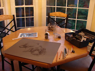
Now I feel old...my two youngest siblings (there are six of us altogether) share the same birthday exactly a year apart. Today Carmen turned 23 and Jessica turned 22. HAPPY BIRTHDAY!

In honor of me getting to post whatever I want on your birthday...here are two portraits of them I shot while taking intro to photography at Buffalo State College. They were really good models! Of course they were young enough back then to still do what big sister told them to do...
Love you guys! Happy Birthday!